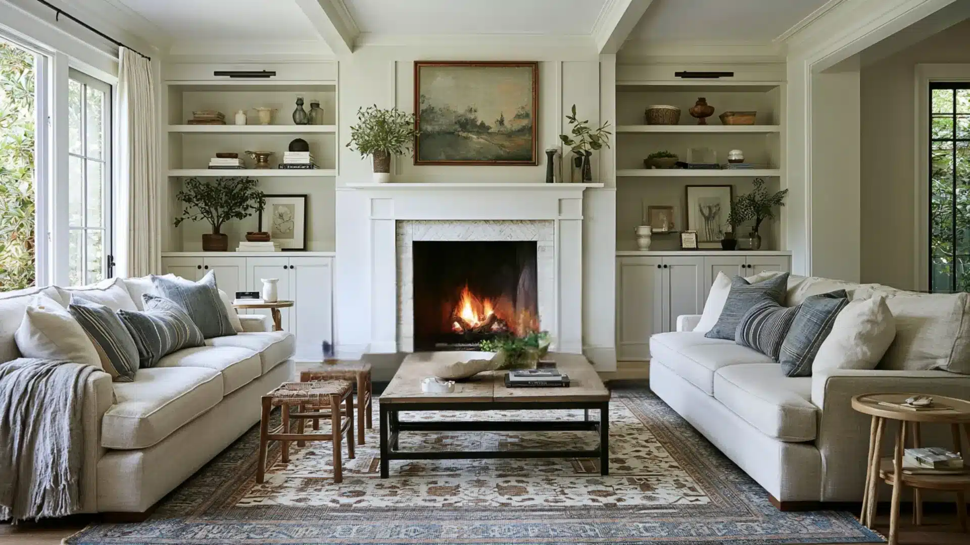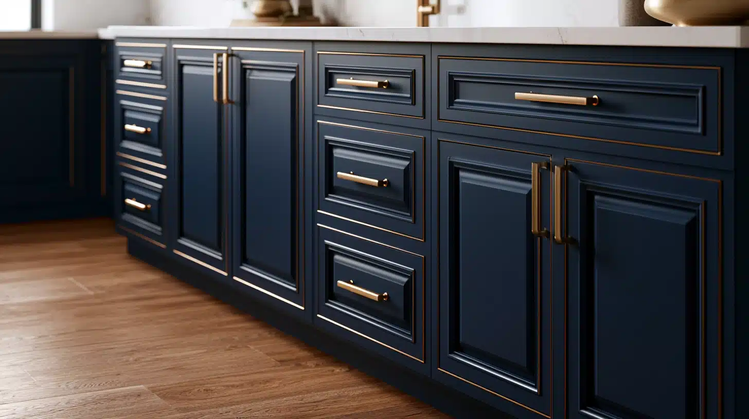



A neutral palette is not just beige, taupe, and a safe wall color.
Done right, it sets the room’s undertone, shapes the mood, and matches the materials already fixed in the space, the wood tones, metal fixtures, and the light coming through the windows.
These combinations below cover modern minimalist, coastal, bohemian, traditional, romantic, industrial, farmhouse, and many more styles, each with exact hex codes and a clear best-use case.
Why Neutral Palettes Outlast Trends
A bold wall color has a shelf life. The moment the trend passes, the room feels dated.
Neutrals skip that problem. They take their cue from what’s already fixed in the room, not from a passing color moment. A well-chosen neutral palette can outlast three or four rounds of new furniture.
What Actually Counts as Neutral
The word “neutral” covers more than beige and gray.
Earthy tones count too. Clay, sand, and warm brown all qualify once the color is muted. Soft pastels count as well. A pale sage or dusty blush works, as long as it reads closer to gray than to a true color.
Cooler shades belong here too. Think driftwood, dove, and ash. Even black and white fit, in their softened forms like charcoal or bone.
What makes a color neutral isn’t the family it comes from. It’s the lack of strong saturation.
What LRV is
LRV stands for Light Reflectance Value. It measures how much light a color bounces back, on a scale from 0 (absolute black) to 100 (pure white).
A color with an LRV of 12, like Soft Charcoal, absorbs almost all the light that hits it and reads dark and dense on a wall.
A color with an LRV of 84, like Warm White, reflects most of that light back and reads bright, even in a dim room.
Two colors can look similar on a paint chip but behave completely differently once they’re on a wall.
A low-LRV color in a small room with one window can make the space feel smaller. A high-LRV color does the opposite — it opens the room up, even under weak light.
Neutral Palettes You Can Use Today
Each palette below leans a specific direction on purpose. Check the undertone first. Don’t just pick by name.
1. Quiet Stone for Modern Rooms

Warm White: #F2EFE9 (LRV 84)
Greige: #C9C2B4 (LRV 58)
Soft Charcoal: #4A4744 (LRV 12)
Brushed Nickel: #B0AEA8 (LRV 46)
This one leans warm gray. By late afternoon, the greige warms just enough to look almost taupe against oak. It sits well next to oak, walnut, or brushed metal.
That light strips the warmth out fast. Use matte or eggshell finish. Keep trim a shade lighter than Warm White.
2. Foggy Coast for a Calm, Airy Feel

Sail White: #F5F3EE (LRV 86)
Sea Salt Gray: #D8D3C7 (LRV 66)
Driftwood Gray: #A8A296 (LRV 42)
Weathered Blue-Gray: #7C8480 (LRV 28)
Under an overcast sky, Weathered Blue-Gray reads soft and driftwood-like, never flat gray. This palette pulls cool and slightly blue. That’s what reads as coastal, not just gray.
It struggles against orange-toned oak floors. Eggshell handles beach-house humidity better than flat paint.
Use a cool white ceiling to keep the warmth from creeping in.
3. Sun-Baked Clay for Warm, Layered Spaces

Terracotta Dust: #C77B58 (LRV 38)
Sand: #DCC7A1 (LRV 62)
Warm Taupe: #A98E72 (LRV 40)
Burnt Cream: #EFE3C8 (LRV 80)
This one pulls its undertone from clay and sand. That’s why it pairs so easily with rattan and brass. In a small, dim room, the warmth can turn heavy fast.
Keep the finish soft matte. Trim should stay close to Sand, not white.
4. Old Money Neutrals for Traditional Rooms

Parchment: #E9E2D0 (LRV 76)
Dove Gray: #B9B3A6 (LRV 52)
Deep Bronze: #5C4B3A (LRV 14)
Aged Brass: #8A6E42 (LRV 24)
Against brass hardware, Deep Bronze reads almost bookish, like an old library shelf.
This palette leans warm and slightly gold. It works well against wood paneling and brass. Stay at eggshell or lower. Use a deeper parchment on trim instead of stark white.
5. Romantic Soft Petal

Blush White: #F1E4DF (LRV 80)
Dusty Rose: #D9B8AF (LRV 62)
Warm Taupe: #B49E92 (LRV 48)
Cream: #F7F1E6 (LRV 85)
This set shares a pink-beige undertone. It softens a room without going full pastel. Cool-toned LED bulbs wash the pink out to flat gray, so watch your bulb choice.
Keep every surface matte. Pick a trim white with the faintest pink undertone.
6. Concrete and Rust for Industrial Rooms

Raw Concrete: #A8A29B (LRV 45)
Charcoal: #3A3835 (LRV 9)
Steel Gray: #6E6B67 (LRV 26)
Rust Orange: #A6512E (accent only, LRV 22)
Beside black steel shelving, Raw Concrete looks deliberately bare, not unfinished.
The base three lean cool and flat. That suits exposed brick and black metal. Skip the rust accent, and the room reads unfinished, not calm.
Use flat on walls. Satin or semi-gloss works on trim.
7. Rustic Weathered Farmhouse Palette

Antique White: #EFE9DD (LRV 79)
Warm Gray: #B7AE9E (LRV 50)
Aged Wood Brown: #6B5847 (LRV 20)
Barn Red: #7A3B32 (accent only, LRV 15)
Next to worn shiplap, Aged Wood Brown looks like it’s always belonged there.
This palette leans warm and dusty. It clashes against cool-toned tile floors. Satin on trim and doors takes daily wear. Flat on walls keeps the worn-in look intact.
8. Nordic Frost Palette

Birch White: #F7F5F1 (LRV 88)
Oat: #E4DCCB (LRV 70)
Ash Gray: #B8B4AC (LRV 50)
Pale Oak: #D9C7A8 (LRV 60)
Leans warm-neutral with a soft gray edge, built for light oak and linen. Dark walnut flooring creates too much contrast with this set.
Matte throughout, flat white trim, nothing glossy.
9. Adobe Sage for Southwestern Rooms

Whitewash: #F0EAE0 (LRV 82)
Sage Clay: #B7A98C (LRV 46)
Adobe Brown: #8A6B52 (LRV 24)
Dusty Sage: #9CAA8C (LRV 38)
Against real adobe brick, Sage Clay looks sun-bleached rather than muddy. This palette blends warm clay with a muted green.
It suits stucco and exposed beams well. Humid coastal air tends to fight this warmth.
Keep walls matte. Let any exposed wood beams carry the sheen instead.
10. Cottage Sage for a Soft, Lived-In Look

Cream Lace: #F3EEE4 (LRV 84)
Sage Gray: #A8AC9C (LRV 48)
Weathered Taupe: #8C8272 (LRV 32)
Soft White: #F6F3EC (LRV 85)
Leans cool green-gray, at home with painted wood furniture and floral textiles. Honey oak flooring pulls too warm for this set.
Eggshell on trim, flat on walls, keep hardware like cabinet brushed rather than polished.
11. Monochrome Ash Palette

Pure White: #FAFAF8 (LRV 90)
Ash Gray: #9C9B96 (LRV 44)
Graphite: #383734 (LRV 8)
Matte Black: #1C1B1A (LRV 3)
This is a true neutral, with no warm or cool lean. It’s built for concrete, glass, and black steel.
Without texture or a plant nearby, it can read cold fast.
Use matte walls, satin trim. Keep the black accent to one surface only.
What Finish to Use, and Why it Matters
Every palette above calls for a specific finish, and that choice matters as much as the color itself.
Matte absorbs light and hides small wall flaws, like uneven drywall or old patch marks. It also scuffs faster and wipes clean less easily, so it struggles in hallways or kids’ rooms.
Eggshell reflects a little more light and stands up to a damp cloth, but it shows more of the wall’s texture underneath.
Satin goes a step further: durable, easy to wipe down, and better suited to trim, doors, and cabinets that get touched often.
As a rule, walls that see less contact can go matte. Anything touched daily like trim, doors, high-traffic walls — holds up better in eggshell or satin.
How to Pick the Right Palette for Your Room
Once you understand why these palettes work, picking your own gets much easier. Here’s the process I always walk homeowners through first.
Match undertones to your fixed finishes.
Start with what you can’t change: your floor, your cabinet hardware, your window trim. Hold a paint chip against your floor sample in daylight before deciding anything.
Check how your lighting changes the color.
North-facing rooms strip warmth away, making a color look cooler. South-facing rooms add warmth, so a cool gray can look faintly green. Warm-white bulbs (2700K) suit palettes like Sun-Baked Clay. Cooler daylight bulbs (5000K) suit Quiet Stone or Concrete and Rust.
Test at two different times of day.
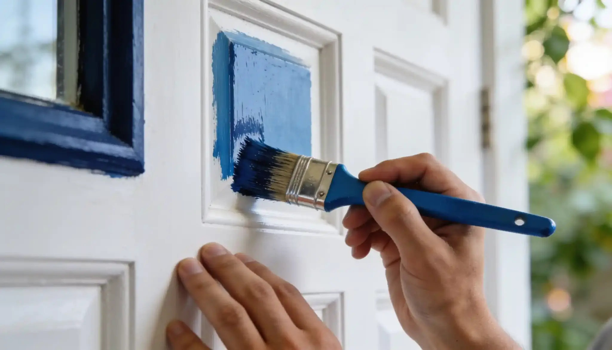
A chip that looks right at noon can shift by lamplight. Tape a large swatch up. Check it in daylight and after dark before you buy a full can.
Choose by undertone and light first, style second.
A palette that suits your fixed finishes looks right in every season. It won’t just work for the one you picked it in.
Testing a Color Without Daylight
Not every room gets natural daylight to test against.
In a basement, an interior room, or a space used only after dark, skip the daylight test and match testing to how the room will actually be used.
Paint a swatch and view it only under the bulbs that will light the finished space.
Warm-white bulbs (2700K) push every neutral warmer than it looks in the store, so a palette like Nordic Frost can read slightly yellow under them. Cooler bulbs (4000K and up) can flatten a warm palette like Sun-Baked Clay into something duller.
Test under the actual bulb, at the time of day the room gets used, not under a window that isn’t there.
Conclusion
Tested combinations, each built around undertone and light instead of a passing trend.
The one test that applies to any palette beyond this list is simple: hold the chip against your floor, then check it under your own bulbs once in the morning and once after dark.
Those two checks matter more than any mood board or color wheel.
Get the undertone and the light right first, and the style choice mostly takes care of itself. The next paint decision takes an afternoon, not a month.
Common Questions About Neutral Color Palettes
1. What Counts as a Neutral Color?
A neutral is any color without a strong, saturated hue, think white, beige, gray, taupe, and soft brown. Most still carry a subtle undertone, warm (yellow, pink, orange) or cool (blue, green), even though they read as plain at first glance.
2. How Many Neutrals Should be in a Palette?
Three to four shades is the sweet spot. One light base, one mid-tone, one deeper anchor, and sometimes a small accent. Fewer than three feels flat, more than four starts competing for attention.
3. Can Warm and Cool Neutrals Mix?
Yes, but one temperature should clearly lead, with the other appearing only in small doses. A cool gray wall with one warm wood accent works better than an even split.
4. What is the Difference Between Warm and Cool Undertones?
Warm undertones carry a trace of yellow, pink, or orange. Cool undertones carry a trace of blue or green. Two chips can look nearly identical in the store and split apart completely on a wall in daylight.