

Light green shows up everywhere.
Spring leaves, mint tea, nursery walls, spa branding. It’s one of those colors everyone recognizes, but almost no one can name exactly.
If you’re picking a paint shade for a room or just matching a color for a design project, a general sense of “light green” won’t cut it.
You need the real codes behind it, and the names each shade goes by once it lands on a paint chip. That’s exactly what’s below.
The Hex Code for Light Green
If you just need one number to copy and paste, this is it. #90EE90 Is the standard light green. It’s the exact code browsers use for the CSS color name “lightgreen,” so it’s a safe, universal pick.
It’s the value baked into CSS, most design software, and every color picker you’ll find online. Use it, and you’re safe.
Picture spring grass, but softer. Less saturated. It sits between white and true green, closer to green. It’s bright without being loud. Think fresh leaves, not neon.
Here’s the full breakdown:
- Hex: #90EE90
- RGB: 144, 238, 144
- HSL: 120°, 73%, 75%
- CMYK: 43%, 7%, 43%, 7%
What Light Green Means and Where It Works
Before you pick a shade, it helps to know why light green gets used in the first place.
A shade that reads calm on a chip can turn flat once it covers a whole wall. It feels fresh, not flashy.
Designers reach for it when they want a space or a brand to feel clean and a little bit alive. It doesn’t shout. It settles.
That’s why you’ll spot it in a few places over and over:
- Interior walls: eggshell or satin finish. Light green shows every flaw in a flat finish.
- Fabric and textiles work well as an accent, less well as an all-over pattern.
- Branding: common in wellness, skincare, and food packaging.
- Digital design: great for backgrounds and success states. Avoid it for body text.
Is There Just One Light Green?
No. Light green is a zone, not one color.
Ten sites can each show a different hex code and all be right, especially once clearing out clutter has left the room ready for an actual color decision.
Here are a few shades of calm to pick from.
1. Mint (#98FF98)
RGB 152, 255, 152
Mint leans cool, with a hint of blue that gives it a crisp, clean feel. It’s the brightest shade in this whole family. Closest brand match: Behr “Fresh Mint.”
- Works well in: bathroom tile, kitchen backsplashes, spring or wellness branding
- Skip it for: large exterior walls in direct sun; it can wash out fast
- Pairs naturally with: white, brushed brass, light wood tones
2. Sage (#9CAF88)
RGB 156, 175, 136
Sage leans warm, with gray and a touch of yellow mixed in. It reads as earthy and grounded, not bright. Closest brand match: Sherwin-Williams “Svelte Sage” (SW 6164).
- Works well in: kitchen cabinets, bedroom walls, farmhouse-style interiors
- Skip it for: small, dim rooms, with too little light, it can read muddy
- Pairs naturally with: cream, black metal fixtures, natural linen
3. Seafoam (#9FE2BF)
RGB 159, 226, 191
Seafoam pulls toward blue more than any other shade here. It feels cool and calm, close to the color of shallow ocean water. Closest brand match: Benjamin Moore “Tranquility” (AC-31).
- Works well in: bathrooms, coastal-style rooms, spa and wellness branding
- Skip it for: high-traffic hallways, scuffs show fast in a satin finish
- Pairs naturally with: white, driftwood tones, brushed nickel
4. Pastel Green (#77DD77)
RGB 119, 221, 119
Pastel green sits close to standard light green, just slightly softer and more muted. It feels playful without being childish. Closest brand match: Pantone’s “Mint Green” family.
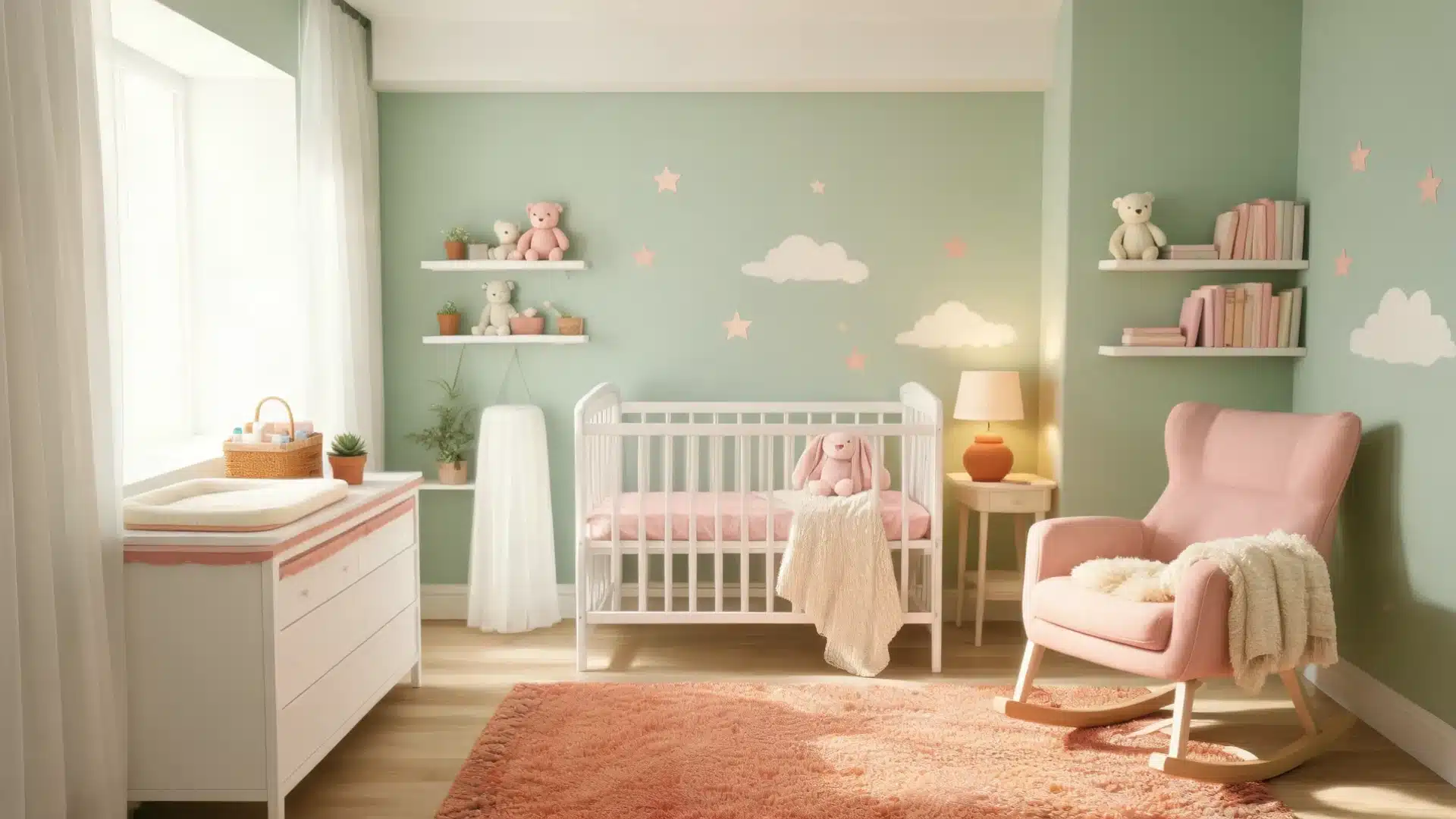
- Works well in: kids’ rooms, spring packaging, playful branding
- Skip it for formal or corporate spaces; it reads too casual
- Pairs naturally with: soft pink, white, pale yellow
5. Honeydew (#F0FFF0)
RGB 240, 255, 240
Honeydew is the palest shade on this list. It borders on white, with just enough green tint to register as green at all. Closest brand match: Benjamin Moore “Tranquility,” mixed at its lightest.
- Works well in: ceilings, trim, subtle accent walls, wedding stationery
- Skip it for: anywhere you want green to be the main event, it’s too faint
- Pairs naturally with: almost anything; it behaves like an off-white
6. Tea Green (#D0F0C0)
RGB 208, 240, 192
Tea green is muted and warm, closer to sage than mint. It has a soft, faded quality, like green that’s been washed a few times. Closest brand match: Benjamin Moore “Guilford Green” (HC-116).
- Works well in: cottage-style rooms, tea packaging, botanical branding
- Skip it for: modern minimalist spaces, it can look dated next to sharp lines
- Pairs naturally with: warm wood tones, brass, cream
What Brands Call These Greens
Once you’ve picked your shade, brand naming adds a whole new layer of confusion. Paint and design brands don’t use hex codes.
They use names built for a shelf, not a screen. Here’s who calls light green what, and where each brand tends to land.
- Pantone groups most pastel and mint-leaning light greens under its “Mint Green” family, used heavily in packaging and print.
- Sherwin-Williams leans warm with names like “Svelte Sage,” a go-to for sage-toned interior walls.
- Behr covers the brighter end with shades like “Green Tea,” which is popular for accent walls.
- Benjamin Moore spans the widest range, from the near-white “Tranquility” to the deeper “Guilford Green.”
Treat these as close cousins, not exact twins. Paint chips shift under different light. Always check a real sample before you commit.
Conclusion
The main hex code for light green is #90EE90, but the shade you actually want depends on the mood you’re after.
Cool and clean, reach for mint or seafoam. Warm and grounded, go sage or tea green.
Barely there, honeydew. Before you commit to paint or fabric, pull a real swatch and look at it in your own light; screens and store lighting both lie.
Copy the hex code above and get started.
FAQ
1. What is the hex code for light green?
The standard hex code for light green is #90EE90. This is the default shade used in CSS and most design tools. Its RGB values are 144, 238, 144, and its HSL values are 120°, 73%, 75%.
2. Is light green the same as mint?
No, they’re close but not identical. Mint (#98FF98) leans slightly brighter and cooler than standard light green (#90EE90). Mint carries a touch more blue, giving it a crisper, cooler feel next to standard light green.
3. What does light green mean in design?
Light green signals calm, freshness, and renewal. Designers use it in wellness, skincare, and food branding because it feels clean without feeling cold. It reads as approachable rather than corporate or clinical.
4. What is the lightest shade of green?
Honeydew (#F0FFF0) is one of the lightest named greens. It’s so pale it borders on white, with just enough green tint to read as green rather than off-white or cream.