

Choosing a paint color is simple until there’s a room full of swatches that all look perfect at the store.
The right color depends on your light source, the room’s fixed elements, and how undertones shift across the day.
But the fastest way to choose a paint color is to identify your room’s dominant light source, pull the undertones from your fixed elements (flooring, furniture, trim), and test at least two full-size swatches (12” x 12” minimum) directly on the wall before buying a full gallon.
Let’s walk through the step-by-step process and tips!
How do You Choose the Right Paint Color?
Choosing the right paint color takes more than picking a shade you like on a chip.
Light, undertones, and your room’s fixed elements all shape how a color looks once it’s on the wall. Follow these steps in order, and you will get it right the first time.
Step 1: Identify Your Room’s Light Source
Before you look at a single color, work out where your light comes from.
North-facing rooms get cool, indirect light all day. South-facing rooms get warm, consistent light.
East-facing rooms are bright in the morning and dim in the afternoon. West-facing rooms are dark in the morning and warm by evening.
Write this down, as every color decision depends on it.
Step 2: Check Your Bulbs
Walk the room at night and look at what your artificial light does to your walls.
Bulbs above 4000K cast cool, blue-white light. Bulbs below 2700K push warm yellow tones.
If your bulbs are mismatched or outdated, consider replacing them before you choose a color. The bulb affects the color as much as the paint does.
Step 3: Pull the Undertones From Your Fixed Elements
Look at everything in the room that you cannot or will not change, such as the flooring, trim, cabinetry, countertops, and any large, permanent furniture pieces.
Each one carries an undertone.
Domestic hardwood floors run warm, such as orange, red, or yellow. Architectural trim is warm white rather than true white.
Kitchen cabinetry is either warm or cool depending on the wood species or paint finish already on it.
A cool-toned wall against a warm wood floor creates tension that reads as a mistake rather than contrast.
Step 4: Decide on Color Temperature
Once you know your light source and fixed-element undertones, decide whether you want warm or cool.
Warm colors like terracotta, ochre, creamy white, and warm taupe work well in dining rooms, living rooms, and bedrooms with limited natural light.
Cool colors like soft blue, sage green, and pale gray suit bathrooms, home offices, and bedrooms.
According to color research published by the American Psychological Association, warm tones increase perceived social warmth, while cool blue-green tones are linked to calm and focus.
Step 5: Narrow Down to Two or Three Colors
Do not test ten colors, as it just creates confusion.
Use your light source and undertone direction to narrow the field to two or three realistic options.
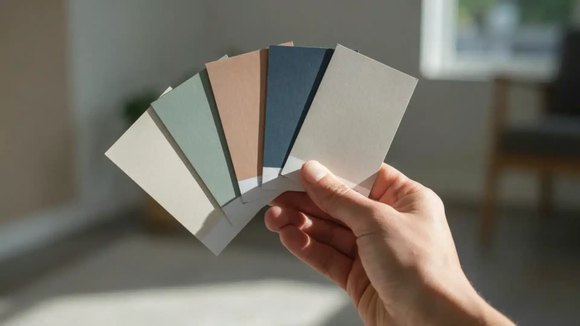
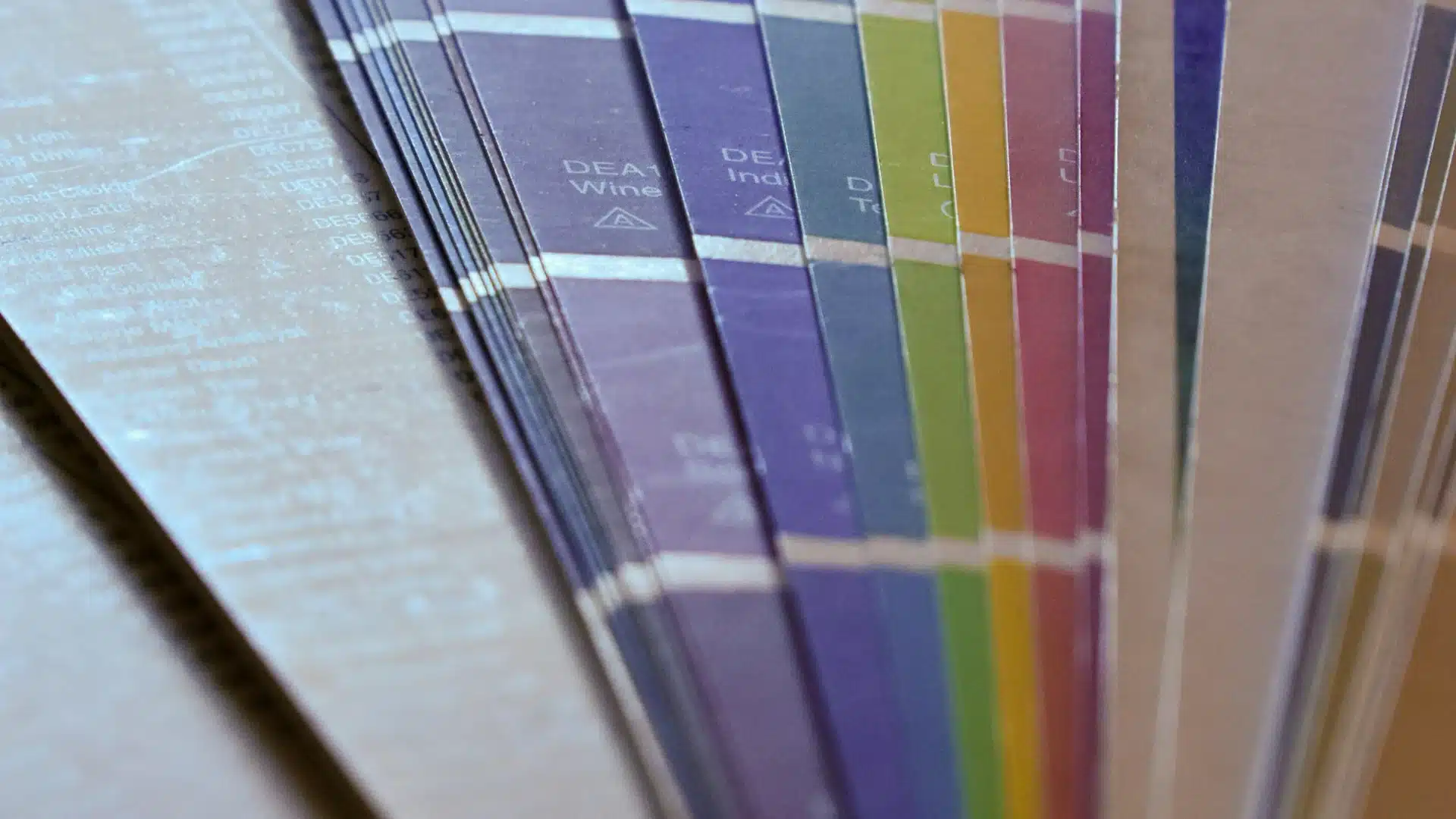
Look at the undertone on each chip using the white paper test. Hold a sheet of plain white printer paper next to the chip, and the undertone will appear clearly.
Eliminate any color whose undertone conflicts with your fixed elements.
Step 6: Buy Sample Pots and Paint Large Swatches
Buy a sample pot for each of your shortlisted colors.
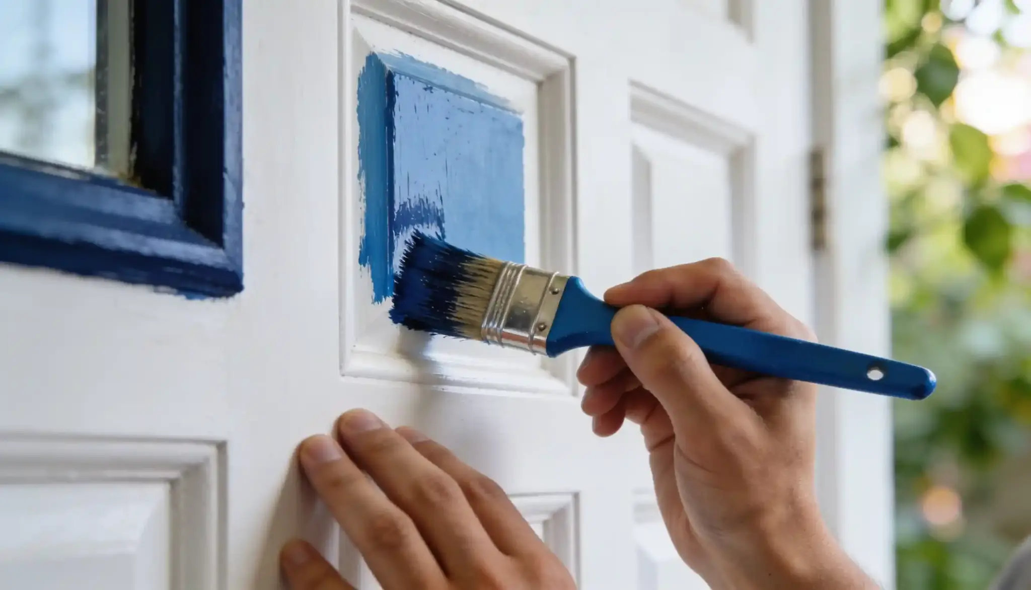
Paint each one as a 12” x 12” swatch directly on the wall, not on card, not on paper stuck to the wall.
A chip that looks right at 2” will often be more saturated and intense at full wall coverage. Paint your swatches in at least two spots, more like near a window and in a darker corner of the same wall.
Step 7: Live With the Swatches for 48 Hours
Check the swatches in morning light, afternoon light, and under your artificial evening lighting.
Do not make a final decision on day one. Colors shift across the day, and the version you see at noon is not the version you will live with most evenings.
Step 8: Check the Color Against Your Trim and Flooring
Before you buy a full gallon, hold a large painted swatch card directly against your trim and lay it on or near your floor.
Look for undertone conflict.
If the wall color and the trim suddenly look like two different whites fighting each other, go one shade warmer or cooler.
If the wall color makes your floor look muddy, the undertones are clashing.
Step 9: Commit and Buy the Right Amount
Once you have decided, calculate your square footage by multiplying wall height by total wall width, then subtracting doors and windows.
One gallon of paint covers approximately 350 to 400 square feet per coat.
Rooms need two coats. Buy accordingly and set aside a small amount for touch-ups.
Step 10: Test the First Coat Before You Finish
Apply your first coat and let it dry fully before assessing.
Wet paint reads darker than dry paint. Step back, check it in all light conditions, and confirm it reads the way you expected.
If the undertone has shifted in a way you did not want, it is far easier to course-correct after one coat.
Choosing a Paint Color According to Your Room
Every room in your home has its own set of conditions. The color that works in your living room will not automatically work in your bathroom.
Here are a few room-by-room ideas to help you make the choice easily.
Living Room
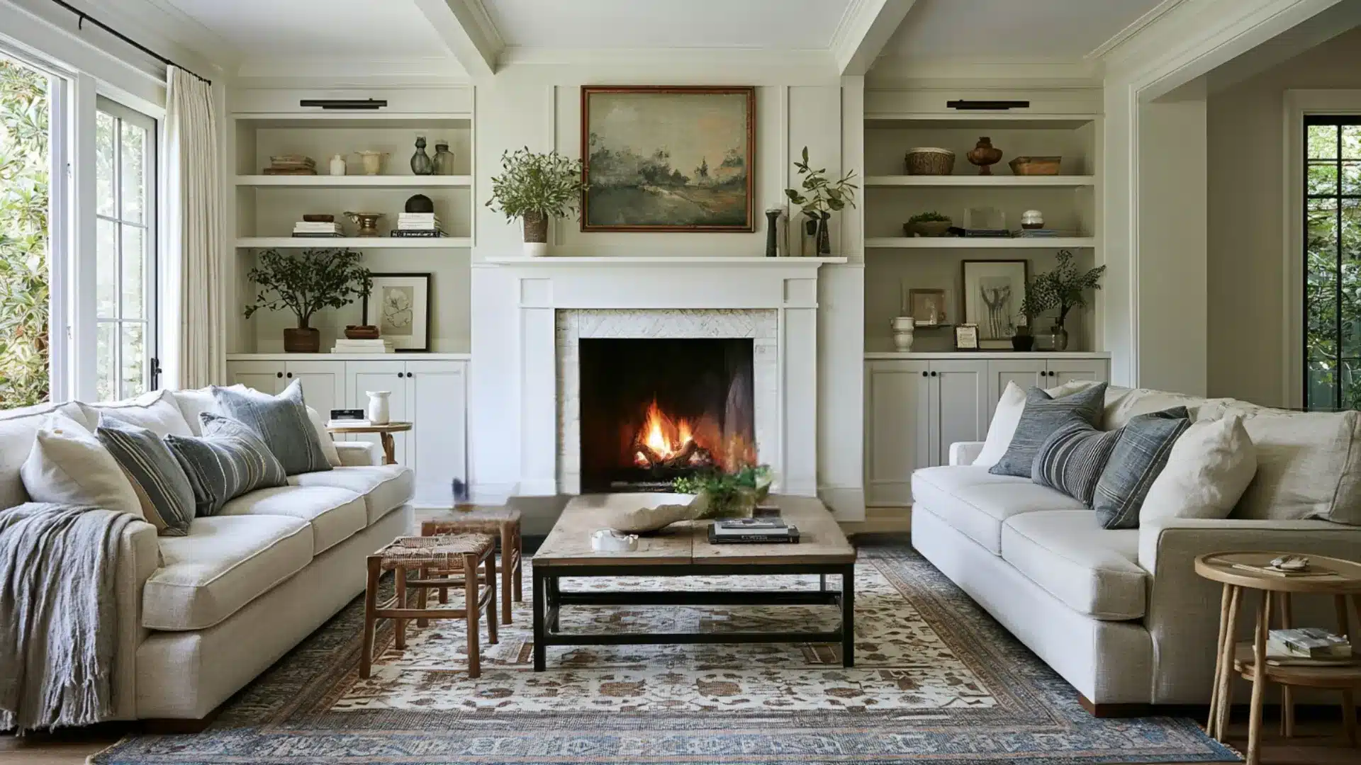
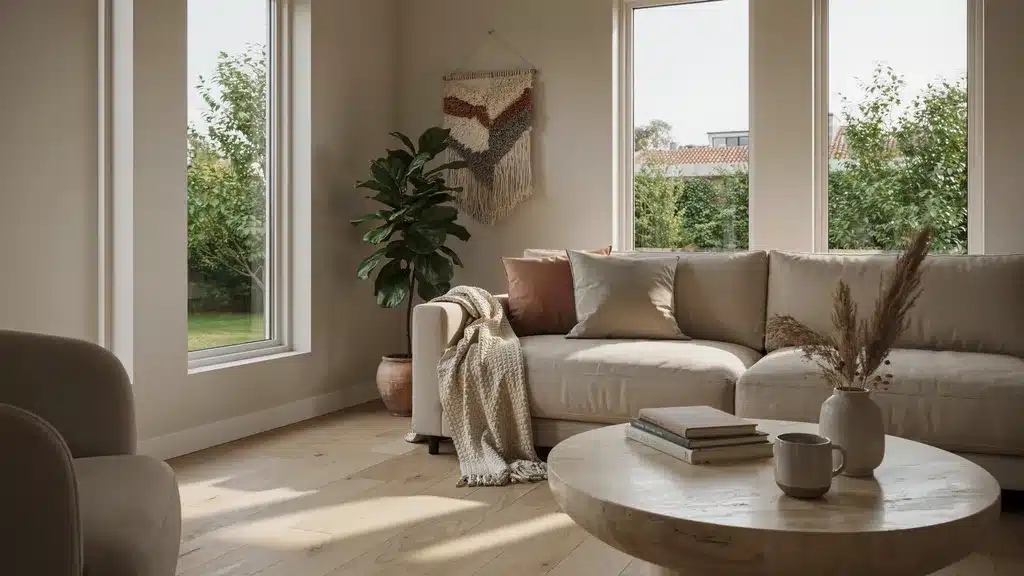
Living rooms handle the widest range of light conditions, such as morning, afternoon, evening, and artificial light, all in one day.
Warm neutrals and mid-tone colors perform best here because they hold up across shifting light.
Bedroom
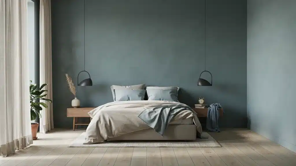
For the bedroom, cool tones like soft blue, muted sage, and pale lavender are linked to lower perceived stress levels and easier wind-down.
Avoid high-saturation colors on all four walls.
Deep, saturated colors work well as a single feature wall behind the bed but can feel oppressive.
Kitchen
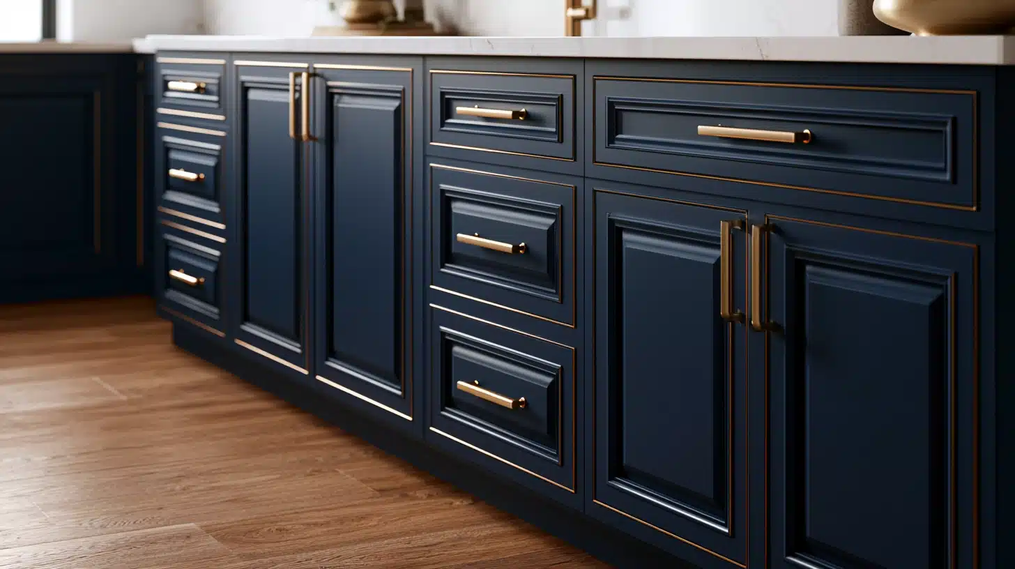
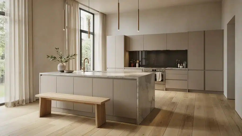
Kitchens already contain strong fixed elements such as cabinetry, countertops, appliances, and tile that anchor the color story.
Your wall color should support those elements, not compete with them.
Bathroom
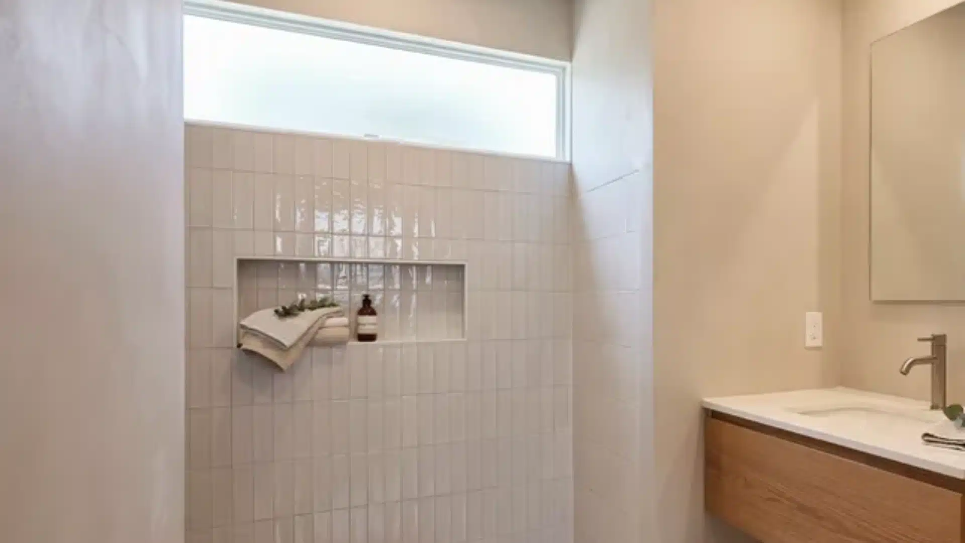
Bathrooms are small with limited natural light.
The key in a bathroom is to finish with a satin or semi-gloss finish, which handles moisture far better than flat or matte.
Also makes undertones appear more pronounced.
Dining Room
Dining rooms are the one space where bold, saturated color works.
Deep greens, rich terracottas, warm burgundy, and dark navy all perform well in dining rooms because the space is used for short periods.
If you want to try a deep color anywhere in your home, the dining room is the right place to start.
End Note
The IT paint color is not the one that looks best on the chip.
It is the one that works in your specific room, under your specific light, alongside everything already in the space, and majorly how it makes your space feel more like you!
Start with light. Follow the undertones. Test on the wall at real scale. Give it 48 hours before you decide.
People Also Ask
1. What Colors Will Make a Room Look Bigger and Brighter?
Light, cool tones like soft white, pale gray, and muted blue reflect more light and increase perceived space. Painting the ceiling slightly lighter adds height.
2. What Colors Make a House Look Expensive?
Deep, muted tones like navy, forest green, charcoal, and warm off-white read as considered and intentional.
3. What Color Should I Choose to Paint the Exterior?
Match your wall color to your roof tone and fixed stonework first. Warm roofs need warm siding. Cool roofs need cool or clearly neutral tones.